Rachel Matts
Creative + Design Direction


After the AIGA Membership project, my team at Kiss Me I’m Polish was asked to rebrand AIGA as an organization—one may say the most graphic designest graphic design project there ever could be. I was truly honored to be able to work on this rebrand.
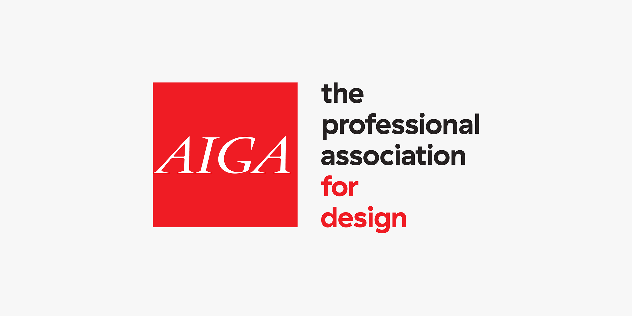
We worked closely with the national leadership to develop an identity that built upon the iconic square mark, and the wordmark developed by Paul Rand himself. We paired the square with a new flexible set of typography, Grilli Type’s Haptik was the perfectly modern geometric counterpart for the existing square. Likewise, we highlighted “for design” in an accent color matching the square. This made the logomark more correctly reflect AIGA’s position as the advocate for design and designers on the national stage.
Additionally, we built a vibrant and flexible identity system inspired by the organization’s national (and international) membership. It included a palette filled with bold color, geometric typography, and a modular grid. We developed a unique grid system built for flexibility with the square logomark at the core of each piece. And don’t worry, the system was all summarized with a comprehensive brand guidelines to help explain the process and carry the brand into the future.
We also introduced a system for all local chapters to use. The goal was to to create a clearer system, while also building in choice so that each of AIGA’s 70+ chapters could keep their own sense of identity.
Lastly, we helped the organization move into their new office with environmental graphics evoking the membership organization.
Agency:
Kiss Me I’m Polish
Collaborators:
Agnieszka Gasparska, Creative Director
Francesca Campanella, Graphic Designer
Min Jin Shin, Graphic Designer